Landing page
Dark Devtool
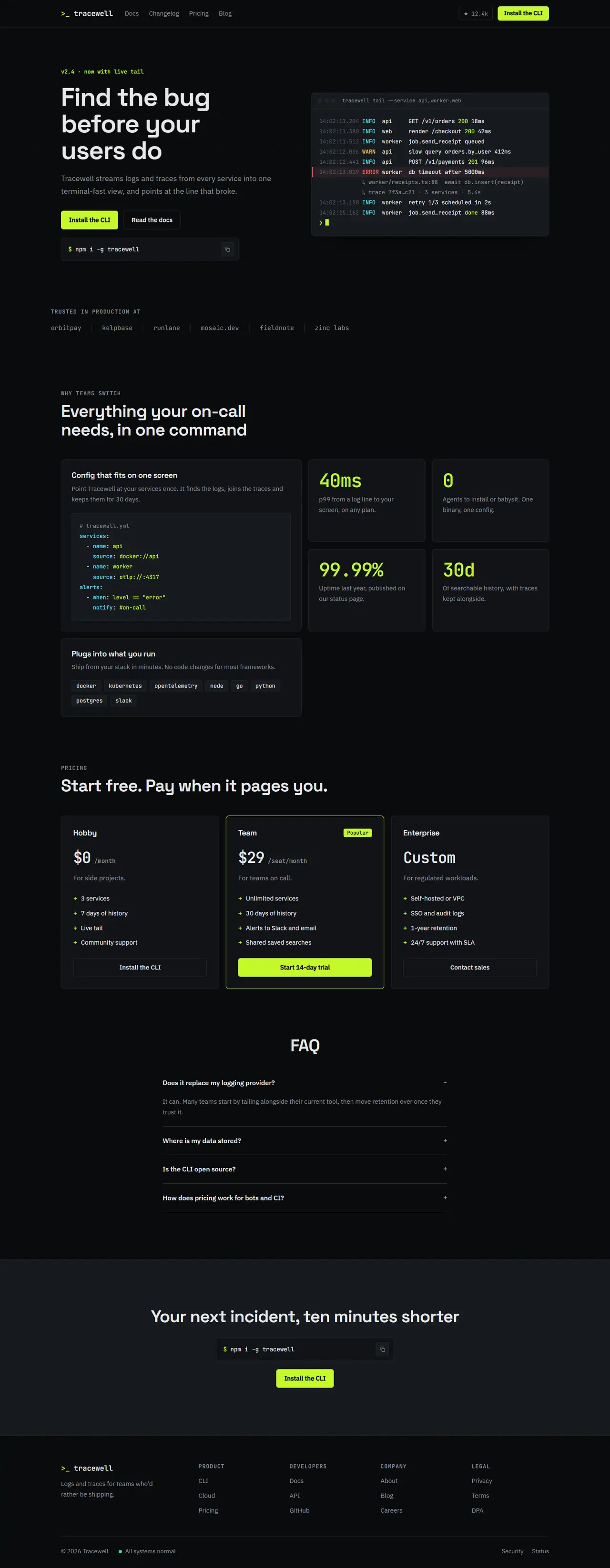
Near-black and technical: monospace details, a live terminal in the hero, a bento feature grid and an electric lime accent. Suits CLIs, APIs and developer platforms.
Your details
Filled into the prompt as you type. Leave one blank and the AI will ask you for it.
Prompt
Build a landing page in the "Dark Devtool" style
You are working in an existing project. Build a landing page for {{product_name}}, a developer tool, in a dark, technical style: near-black surfaces, monospace details, a working terminal in the hero and one electric lime accent.
1. Adapt to this project
- Detect the framework and styling system already in use (for example Next.js + Tailwind, Vue, Svelte, plain HTML/CSS) and build with them.
- Reuse existing components and the project's theme where they fit. Map the tokens below onto the theme (CSS variables or the Tailwind config) instead of hard-coding hex values in components.
- Do not add a dependency without asking first. No syntax-highlighting library: colour the code with spans.
2. Design tokens
- This page is dark in both colour schemes (set color-scheme: dark on it). Background #0a0b0d, surface #111317, raised surface #171a1f, text #e6e8eb, muted #8b919a, border #22262d.
- Accent lime #c5f82a with text #0a0b0d on it. Code colours: cyan #5ee1ff (keywords, info), lime (strings, success), amber #ffd166 (warnings), red #ff6b6b (errors), muted for comments.
- Fonts (Google Fonts): headings "Space Grotesk" 600 with -0.02em letter-spacing, body "IBM Plex Sans" 400/500, mono "JetBrains Mono" 400/500 for code, labels, numbers and the eyebrow lines.
- Type scale: h1 60px / 1.05 (38px on mobile), h2 40px / 1.1 (28px mobile), h3 18px, body 16px / 1.65, mono labels 13px uppercase with 0.08em tracking.
- Radius: 8px cards, 6px buttons, 4px code chips. Spacing unit 8px. Sections 112px top and bottom (72px mobile). Max content width 1200px, 24px side padding.
- Background texture: a 24px dot grid (1px dots at 6% white) behind the hero only, fading out towards the bottom with a mask.
3. Layout, section by section
- Navigation (sticky, background at 80% opacity with blur, 1px bottom border): a mono wordmark: the prompt mark
>_in lime followed by {{product_name}} in lowercase, links (Docs, Changelog, Pricing, Blog) in muted text, a GitHub-style pill "★ 12.4k" with a border, and a small primary button "{{primary_cta}}". Links hide behind a menu button below 900px. - Hero (two columns, text left, terminal right; stacked on mobile): a mono eyebrow in lime ("v2.4 · now with live tail"); the h1 "{{tagline}}"; one muted paragraph; a primary lime button "{{primary_cta}}" and a ghost button "Read the docs"; under them an install command box in mono ("$ npm i -g …" with the product name in lowercase) with a copy icon button on the right. The terminal is a raised-surface window with three dots and a title in its top bar, showing 10–12 coloured log lines (timestamps in muted, levels in their colours, a highlighted error line with a red left border) and a blinking block cursor on the last line.
- Social proof: a mono label "TRUSTED IN PRODUCTION AT" and six fictional company names in muted mono, separated by thin vertical rules. Wraps on mobile.
- Features as a bento grid (4 columns on desktop, 1 on mobile): a large card spanning 2 columns and 2 rows with a short config file shown as code; three stat cards, each with a big mono number in lime ("40ms", "0", "99.99%") and a one-line explanation; one wide card spanning 2 columns with a horizontal list of integrations as mono chips. All cards: surface background, 1px border, and on hover the border turns lime.
- Pricing: three plans in a row (Hobby, Team, Enterprise). Team has a lime border and a lime "Popular" chip. Prices in mono. Each plan lists features with a lime "+" before each line. Enterprise has a ghost "Contact sales" button.
- FAQ: a single centred column, max 720px, questions as details/summary with a mono "+" / "−" sign on the right.
- Final call to action: a raised-surface band with the h2, the install command box again and the primary button.
- Footer: mono wordmark, four link columns, and a bottom row with the copyright, a green "All systems normal" status dot and links.
4. Components and details
- Headlines and quotes use text-wrap: balance so no line ends with a single orphaned word.
- Primary button: lime background, near-black text, 600 weight; hover brightens slightly and moves up 1px. Ghost button: border colour border, text colour, hover raised surface.
- Inline code and chips use the raised surface, 1px border and the mono font.
- Motion: the cursor blinks (1s steps); cards lift their border colour on hover in 150ms. No other motion. Respect prefers-reduced-motion (stop the blink).
5. Responsive and accessible
- Mobile (375px): one column, the terminal and code blocks scroll horizontally inside themselves, never the page.
- Visible focus rings (2px lime outline, 2px offset), contrast at least 4.5:1 for all text including muted, one h1, the terminal marked as an image with a text alternative, and the copy button has an accessible label.
6. Content
Use these values and keep any {{…}} placeholder you don't have; ask me for it instead of inventing it. Write the remaining copy (logs, features, plans, FAQ) to fit the product.
- Product name: {{product_name}}
- Tagline: {{tagline}}
- Primary call to action: {{primary_cta}}
7. Done when
- All eight sections exist and use the tokens above.
- No horizontal scroll at 375px.
- The page builds and passes the project's lint, with no new dependencies.
Paste it into Claude Code, Cursor, v0 or any AI coding tool, inside the project you want to restyle. The prompt tells it to use your stack and components and to ask before adding dependencies.